
JAMS includes various features for data analysis and visualization. In addition to aggregating spatio-temporal data in space/time and displaying or exporting the results (e.g. as shown here), JAMS offers a unique option to visualize data in space and time, making use of the NASA Worldwind engine. In order to use Worldwind in JAMS, various preparatory steps are required which are described in this article. The JAMS/J2K Gehlberg example dataset (as it comes with JAMS) will be used for demonstration.
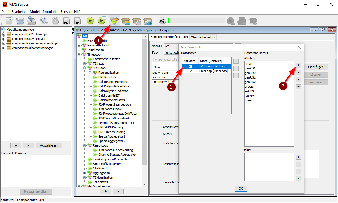
- The main precondition to display and analyze data in space-time is the creation of according model outputs. This can be achieved by creating a workspace which outputs model results at each point in time (e.g. each day) and space (e.g. each HRU). From the opened model, open the output configuration dialog (1), select/create a spatial datastore as e.g. HRULoop (2) and configure the output variables to be stored (3). Please add the area variable if you want to apply area-based conversions (e.g. L -> mm).
- A second requirement for spatial visualization is the definition of your baseline geometries. These have to be provided as a Shapefile which is typically stored in the input/local/gis/hrus directory within your workspace. Once you have stored the Shapefile, please open the hrus.xml file within the input directory and change the parameters therein according to your geometry data. The most important attribute to set here is the key attribute which corresponds to the IDs of your spatial model units. While this is set to POLY_ID by default, you may probably want to set it to your specific value such as cat or value. Please refer to the existing attributes of your Shapefile by opening it in your favourite GIS. In the hrus.xml file, you can also change your Shapefile’s location as a relative path under input/local in case you want to change the default value (e.g. gis/hrus/hrus.shp).
- Run the model in order to create the configured output datastore. Please notice that – depending on number of model units/time steps and variables chosen – the simulation may take a long time and comsume large amounts of disc space. Therefore, select only those variables for output that you want to analyze/visualize.
- Open the data explorer (JADE) by pressing CTRL+J or by selecting the JADE icon from the toolbar

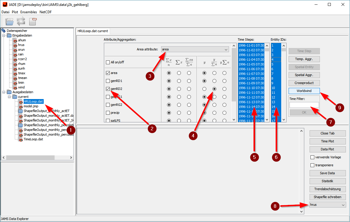
- In JADE, open your output datastore by double clicking it in the data tree on the left (1). Then, mark the attribute to be vizualized (e.g. simulated interflow – genRD2) (2). Optionally, choose to make a unit conversion by selecting the area attribute (3) and by selecting the divide by area function (4). In this example, genRD2 will be converted from liters to mm, making the values better comparable during visualization. Then, select the time steps (5) and spatial units (6) you want to visualize. While in most cases you can simply choose all (click into the list and press CTRL+A), for large datasets it may be advisable to select just a subset of time steps and/or spatial units. Please note that you may use the time filter (7) to select time steps based on a pattern (e.g. *-*-01* will select all first days of all months/years). The last option to be set is the spatial dataset you want to use as the basis for visualization (8). This refers to the baseline data that you have prepared under step 2, i.e. a Shapefile with the geometries of your spatial model units. Finally, press the Worldwind button (9) to start the Worldwind viewer. Please be patient here as the extraction of all data and the loading of the viewer may take some time.
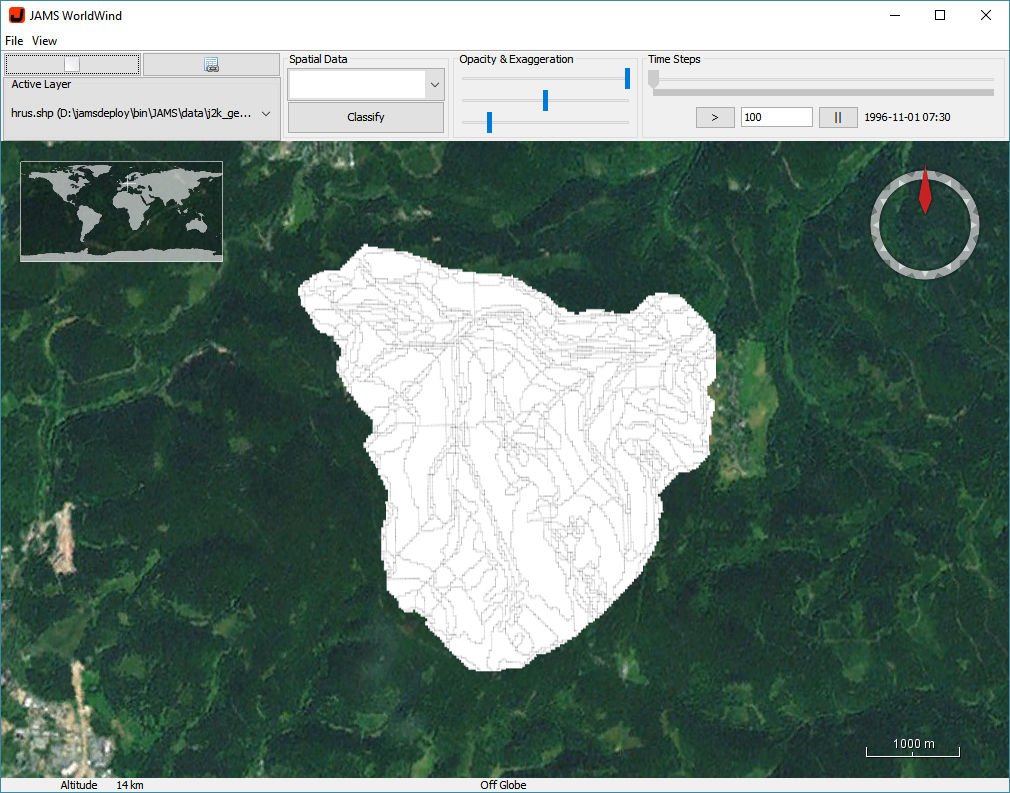
- In Worldwind, you should see a digital globe which has zoomed already to the extent of your spatial model units’ geometries.
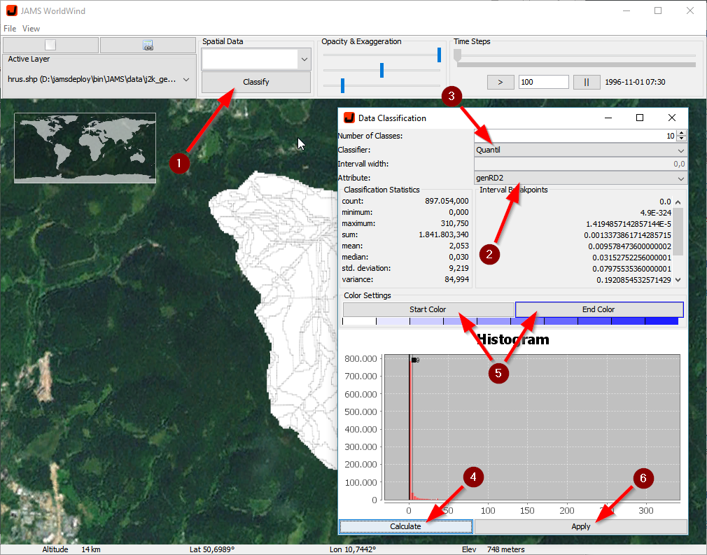
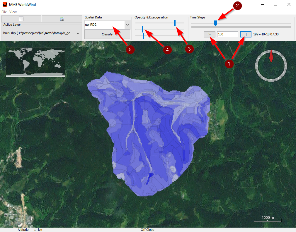
- In order to display your model results, you first need to create a classification of your data and a related color ramp. For this purpose, press the Classifiy button (1), select the attribute to classifiy (e.g. genRD2) (2), choose the classification method (e.g. the quantile classification) (3), and start the classification (4). After the processing is finished, you can select the color range for the result visualization (5) before pressing the Apply button in order to start the visualization (6).
- Once the classification was done, you can press the start/stop buttons (1) to start/stop the visualization. The delay between two time steps is set to 100ms and can be changed using the text fiel between the buttons. Alternatively, you can directly jump to any model time step using the slider above (2). The visualization can further be controlled with regard to transparency (3) and border thickness of the geometries (4). In the case that more than one attribute was extracted in step 5, you can repeat the classification for other attributes. By selecting one of them with the attribute select box (5), you can switch between different classifications.
- Other options of visualization include
- panning: left-click into the display outside of your model area while moving the pointer
- zooming: use the scroll function of your pointing device
- tilting: right-click into the display while moving the pointer
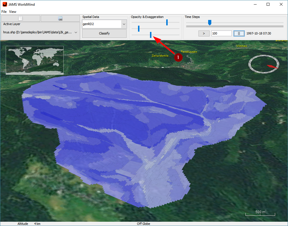
Moreover, the 3D surface can be exaggerated (1).
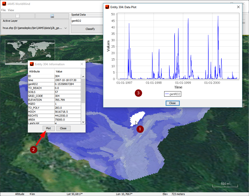
- In order to access information of individual model entities, just move the pointer over the model unit (it will be highlighted) and left-click it (1). A dialog window will open, showing all static and updated time-dependent parameters of the unit. By selecting the Plot function (2), a graph window will open, showing all extracted data in a simple time-series plot (3).
- On demand, additional Shapefile layers can be loaded into the viewer, chosing the File -> Open Shapefile… function from the Worldwind menu.